Tuesday, 18 January 2011

Analysis Of Magazine Advert


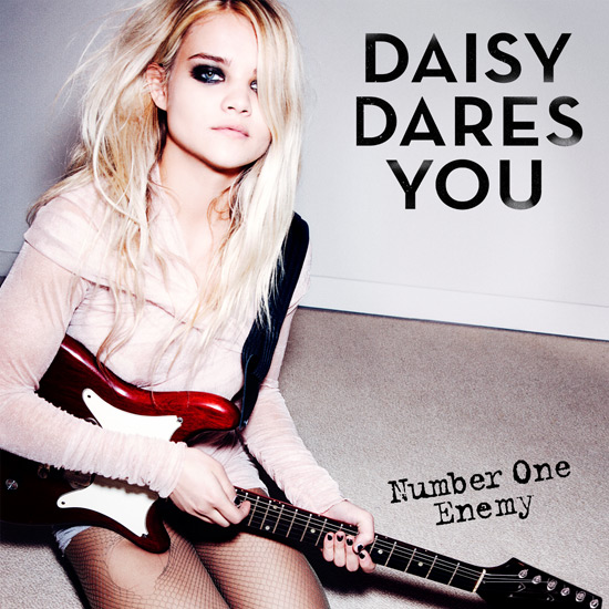
The image of Daisy is Daisy looking straight into the camera with her hair covering one eye which could indicate that she is hiding something. Her eye make up is very black which could indicate something dark and black. The text is very big and bold which stands out to the audience and also because it is black it fits in well with her guitar and her make up.
The guitar which Daisy has is very rock like which Daisy is a punk like artist. The guitar is red and black, the colour red could represent danger and the colour black could represent death, these colours contrast with each other.
The background of this album cover is very dull and plain. The image which Daisy is giving off is that she is not a very feminem artist.
Daisy has a intentioanl rip in her tights, this is showing that she does not care about her image as a female artist such as Beyonce wouldn't wear tights with a huge hole in. This album cover represents Daisy and her image, her image is a kind of rock chick look. Her music also relates to her image.

Analysis Of Magazine Advert


This magazine advert stands out a lot because of its bright colours and the colour of Katy Perry's hair. The colour of Katy's hair is a bright purple colour which fits in well with the colour of the background. The image of Katy Perry, she is looking up towards the sky this could be showing that she is dreaming as the album is called teenage dream. The pink glowing bubble around the text of Teenage Dream makes the text stand out.
The name "Katy Perry" is like candy because of the colours which Katy Perry has on her albums because she wants her album cover to be like dreamy and her video called "California girls" has lots of things with sweets in and is her main focus on her album covers.
The image of Katy Perry is very bright and colourful. The purple wig which Katy Perry's wearing contrasts with the background of the image as the background has lots of colours. Katy Perry's make up is very natural and she is wearing pink lipstick which shows her feminism and the lipstick also matches the colour of the text.

Wednesday, 12 January 2011

Photograph For Inside My Digipak


This is the photo I want to use for the left hand side of my digipak. Using a medium close up shows an up close image of the artist. The photo is a side shot, which shows my artist. My artist is looking straight into the camera which is connecting with the audience.

2nd Attempt At My Album Cover


I decided to change the font of Jesse as the font I have chosen is like somebody has hand written the name as I wanted it to look delicate and sophisticated. I decided to change the font of "Love On The Rocks" because I wanted the font to replicate the word rocks so I tried to find the best font which replicates a rough look.